Bootstrap Login forms Popup
Introduction
Sometimes we really need to defend our valuable web content to provide access to only several people to it or else dynamically personalize a part of our web sites depending on the particular customer that has been actually viewing it. However how could we actually know each certain site visitor's identity since there are certainly so many of them-- we need to get an convenient and reliable solution getting to know who is whom.
This is where the user accessibility control comes along initially interacting with the website visitor with the so knowledgeable login form element. Inside the latest 4th edition of one of the most prominent mobile friendly web page creation framework-- the Bootstrap 4 we have a plenty of elements for setting up this kind of forms so what we are definitely going to do here is taking a look at a certain example exactly how can a basic login form be made utilizing the useful tools the current version comes with. ( useful source)
The best way to make use of the Bootstrap Login forms Code:
For starters we need to have a
<form>Inside of it several
.form-groupTypically it's easier to utilize visitor's e-mail in place of making them identify a username to affirm to you since generally anybody realizes his mail and you can easily regularly ask your site visitors another time to exclusively provide you the solution they would like you to address them. So inside of the first
.form-group<label>.col-form-labelfor = " ~ the email input which comes next ID here ~ "Next we require an
<input>type = "email"type="text"id=" ~ some short ID here ~ ".form-controltypeNext comes the
.form-group<label>.col-form-labelfor= " ~ the password input ID here ~ "<input>After that comes the
.form-group<label>.col-form-labelfor= " ~ the password input ID here ~ "<input>Next we must put an
<input>.form-controltype="password"id= " ~ should be the same as the one in the for attribute of the label above ~ "Ultimately we need a
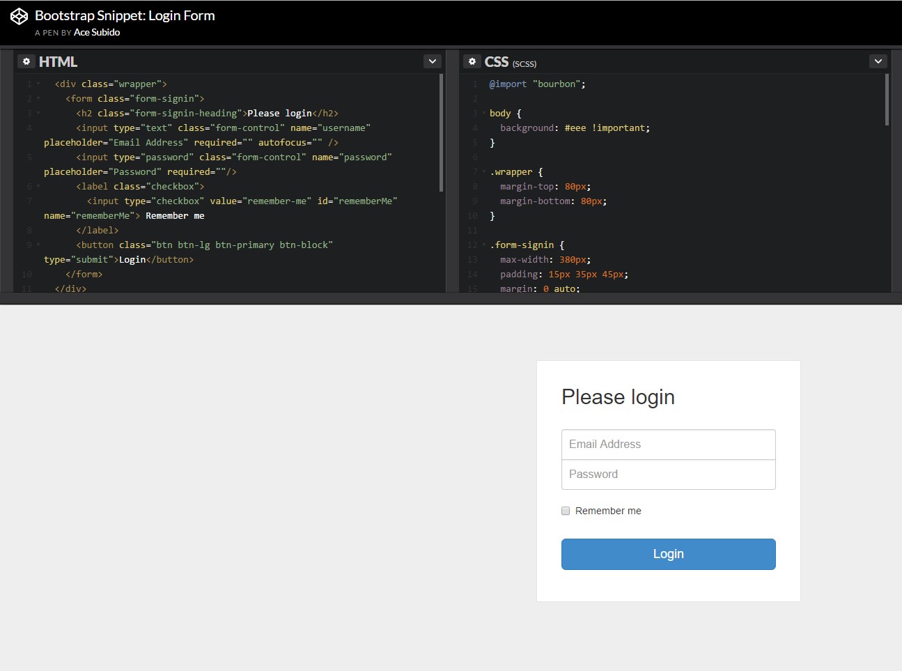
<button>type="submit"Example of login form
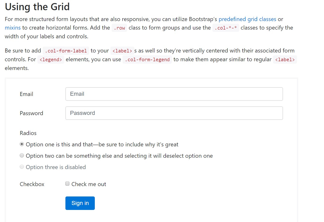
For even more designed form layouts which are equally responsive, you can easily apply Bootstrap's predefined grid classes alternatively mixins to generate horizontal forms. Incorporate the
. row.col-*-*Be sure to include
.col-form-label<label><legend>.col-form-legend<label>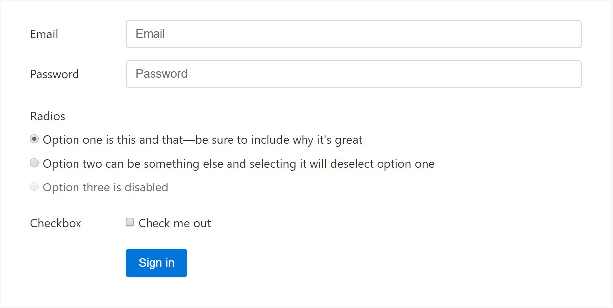
<div class="container">
  <form>
    <div class="form-group row">
      <label for="inputEmail3" class="col-sm-2 col-form-label">Email</label>
      <div class="col-sm-10">
        <input type="email" class="form-control" id="inputEmail3" placeholder="Email">
      </div>
    </div>
    <div class="form-group row">
      <label for="inputPassword3" class="col-sm-2 col-form-label">Password</label>
      <div class="col-sm-10">
        <input type="password" class="form-control" id="inputPassword3" placeholder="Password">
      </div>
    </div>
    <fieldset class="form-group row">
      <legend class="col-form-legend col-sm-2">Radios</legend>
      <div class="col-sm-10">
        <div class="form-check">
          <label class="form-check-label">
            <input class="form-check-input" type="radio" name="gridRadios" id="gridRadios1" value="option1" checked>
            Option one is this and that—be sure to include why it's great
          </label>
        </div>
        <div class="form-check">
          <label class="form-check-label">
            <input class="form-check-input" type="radio" name="gridRadios" id="gridRadios2" value="option2">
            Option two can be something else and selecting it will deselect option one
          </label>
        </div>
        <div class="form-check disabled">
          <label class="form-check-label">
            <input class="form-check-input" type="radio" name="gridRadios" id="gridRadios3" value="option3" disabled>
            Option three is disabled
          </label>
        </div>
      </div>
    </fieldset>
    <div class="form-group row">
      <label class="col-sm-2">Checkbox</label>
      <div class="col-sm-10">
        <div class="form-check">
          <label class="form-check-label">
            <input class="form-check-input" type="checkbox"> Check me out
          </label>
        </div>
      </div>
    </div>
    <div class="form-group row">
      <div class="offset-sm-2 col-sm-10">
        <button type="submit" class="btn btn-primary">Sign in</button>
      </div>
    </div>
  </form>
</div>
Conclusions
Generally these are the basic elements you'll want to establish a standard Bootstrap Login forms Layout with the Bootstrap 4 framework. If you're after some extra complicated looks you are really free to have a full advantage of the framework's grid system setting up the elements just about any way you would think they should take place.
Take a look at a number of video clip short training relating to Bootstrap Login forms Css:
Linked topics:
Bootstrap Login Form approved records
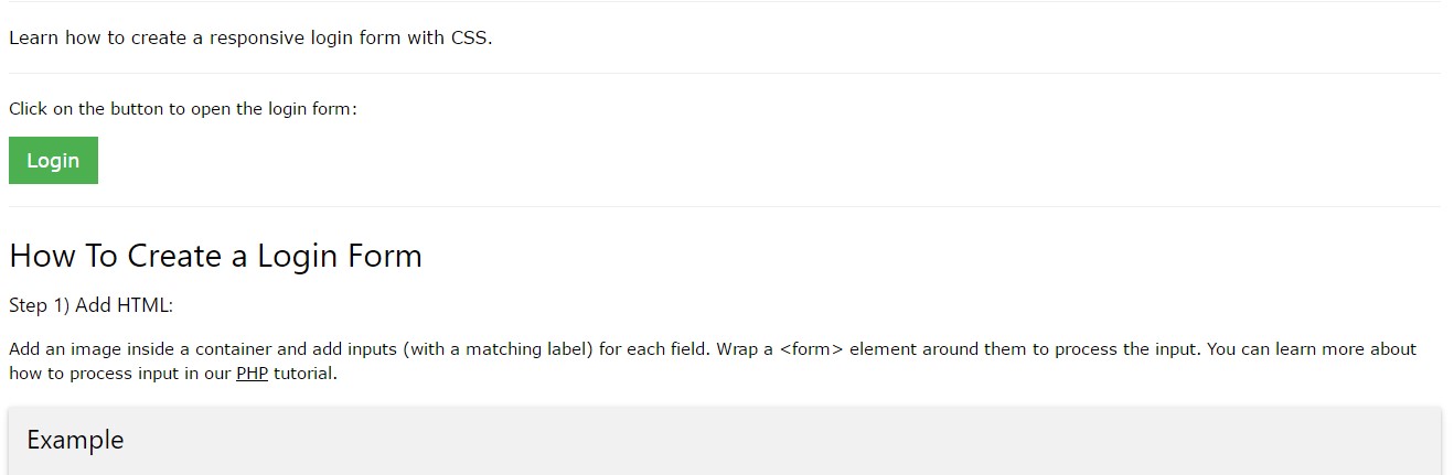
Information:How To Create a Bootstrap Login Form
Another example of Bootstrap Login Form